If only someone paid me everytime I visited CSSTrick’s flexbox guide…or at least all those times when I fiddled around {justify,align}-{content,items} trying to make something happen on screen.
I wanted to form a better mental model of all the basic functionality that flexbox provides for all those common-denominator daily-purpose needs. This is a post about that I’ve been intending to write for while now. It’s hard to beat the succinctness and completeness that CSSTricks manages around this, so I won’t try. Flexbox is powerful, so trying to “simplify” it means we’d have to have assumptions:
- The document’s layout is left-to-right, like English.
- The
flex-directionis set to the default (row), which means the natural direction of elements order is left-to-right order, owing to assumption 1.
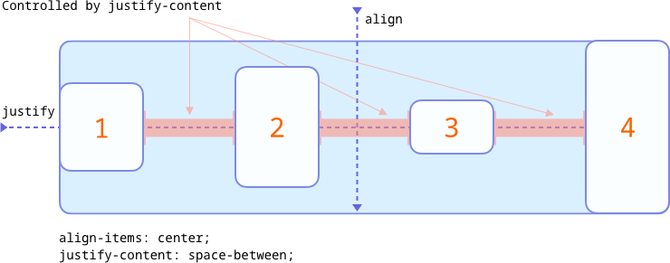
With that intro, here’s the start: There are only two properties you’ll need to know to use flexbox are align-items and justify-content. These two cover many usecases one might have: aligning each item on an imaginary line in various ways and varying spacing. align-items aligns each of the “flex items”—a term used to denote the direct children of the element that has display: flex—along a vertical axis. justify-content aligns each of the items along a horizontal axis1.
Multi-line content
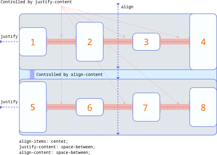
By default a flex container’s content doesn’t wrap, but can be controlled using the flex-wrap: 1 property. With wrapped content, there’s one more property we’ll have to know: align-content. This property controls the alignment of the wrapped lines along a vertical axis.
To summarize, align-* properties work on the vertical axis, and justify-* properties work on the horizontal axis.
Detour: items and content
-items and -content have to be the most common suffixes used, and it’s worth knowing what they represent since that helps a lot with the mental model.
items are the direct children of a flex-container. Not one-level below, not two-levels below. Direct. This is also a small hint why there’s no justify-items for flex layouts2; there’s no alignment axis left.
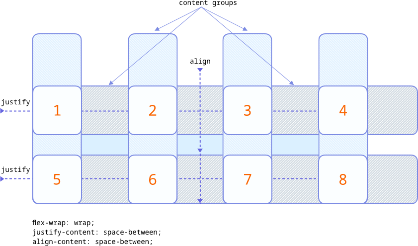
content deals with a group of elements. On the horizontal axis, this is the imaginary container that surrounds the items when there’s only one line (no wrapping). In the case of elements inside a container spanning multiple lines, each line forms one group. The same goes for elements in the vertical axis:imaginary container grouping items along the vertical axis. This is a hint on why align-content doesn’t make sense for non-wrapped container: there’s only one group along the vertical axis.
Put together, and assuming elements of the same size, the alignment of content could be visualized like so:
A codepen for a similar layout: https://codepen.io/kgrz/pen/YzPGxjV. Although the image and the example show items aligned in a neat grid, it’s not the case always. The grouping and gaps themselves are flexible. That means, if the items were of varying sizes (and missing completely, perhaps), the alignments might be different.
I guess it goes without saying that this is only to have a basic (even inaccurate) mental model. Head over to Mozilla Developer Network’s docs for a more thorough and correct explanation of all this.
Another useful illustration to demonstrate the {justify,align}-{content,items} matrix is in the spec: Overview of Alignment Properties
Footnotes
-
The horizontal and vertical axes are dependent on the document’s layout/locale being left-to-right/right-to-left and the
flex-directionset torow. ↩


